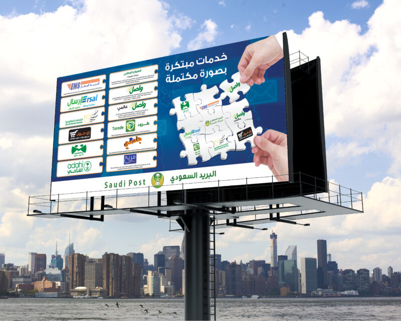
Flex Banner Design: Crafting Impactful Visuals for Effective Advertising

Flex banners are a staple in outdoor advertising due to their versatility and resilience. An effective flex banner design captures attention, conveys a message succinctly, and withstands environmental elements. Here’s how to create a flex banner that stands out.
Understanding Flex Banners: Flex banners are made from a flexible PVC material, which makes them durable and suitable for both indoor and outdoor use. They are commonly used for promotional events, storefronts, and exhibitions.
Creating a flex banner design in Photoshop involves several steps, from setting up the correct document size and resolution to designing and exporting the final product. Here’s a guide to help you create an effective flex banner design:
Setting Up Your Document:
- Open Photoshop and create a new document.
- Size: Choose a standard size for your banner. Common sizes range from 1 meter to 5 meters in width, with lengths customized to your needs. For example, a typical roll-up standee might be 3 feet by 6 feet (36 inches by 72 inches or 914.4 mm by 1828.8 mm).
- Resolution: Set the resolution to 72 pixels per inch for large banners, which is sufficient for viewing from a distance. For smaller banners or those that will be viewed up close, a higher resolution of 150-300 pixels per inch may be more appropriate.
Designing Your Banner:
- Background: Start with a background layer. You can choose a solid colour, a gradient, or even a pattern.
- Text: Add text layers for your message. Make sure the font size is large enough to be read from the intended viewing distance.
- Images: Place high-resolution images or graphics relevant to your message. Use the ‘Free Transform’ tool (Ctrl+T) to adjust the size and position.
- Branding: Incorporate your logo and brand colours to maintain consistency.
- Effects: Apply layer styles like drop shadows, strokes, or glows to make elements stand out.
- Alignment: Use guides and rulers to ensure all elements are aligned and evenly spaced.
Exporting Your Design:
- Save: Save your work in PSD format to preserve layers for future edits.
- Export: For printing, export your design as a high-quality JPEG or TIFF file.
Tips:
- Watch tutorials for step-by-step guidance on creating flex banners in Photoshop with live printing proof. There are many available online, such as “How to make Flex Design in Banner Photoshop cs Ready to Print”
- Always preview your design at 100% zoom to check for clarity and legibility.
- Consult with your printer for any specific file requirements they may have.
Remember, the key to a great flex banner design is readability, visual impact, and brand consistency. By following these steps and utilizing the resources available, you can create a professional-looking banner that effectively communicates your message.
Design Essentials:
- Clarity: The message should be clear and easy to understand at a glance.
- Hierarchy: Prioritize information based on importance to guide the viewer’s eye.
- Contrast: Use contrasting colours for text and background to enhance readability.
- Imagery: High-resolution images or graphics should be relevant and add value to the message.
- Branding: Consistently use brand colours, logos, and fonts to reinforce brand identity.
Design Tools and Resources:
- Canva: A user-friendly online tool with customizable templates and a drag-and-drop editor, perfect for creating banners for various platforms1.
- Freepik: Offers a vast collection of free vectors, stock photos, and PSD files for flex banner designs23.
- Shutterstock: A resource for high-quality flex banner design stock photos, vectors, and illustrations4.
- Dribbble: A platform to explore creative flex banner design images and gain inspiration from designers worldwide5.
- Download Free Flex banner Design and Free PNG, PSD, CDR file format, Islamic Banner, Muharram poster design, Panaflex design ideas, Panaflex design for shop and hotel, Urdu stylish fonts and more…
Flex Banner Design Tips:
- Keep it Simple: Avoid cluttering the banner with too much text or too many images.
- Focus on the Call-to-Action: Make the CTA prominent and compelling.
- Test for Distance: Ensure the design is legible from the intended viewing distance.
- Consider the Environment: Choose colours and materials that suit the banner’s location and lighting conditions.
Choosing the right CMYK colours:
Choosing the right CMYK colours for your flex banner design is crucial for ensuring that the printed colours match your expectations. Here’s a guide to help you select CMYK colours for your design:
Understanding CMYK: CMYK stands for Cyan, Magenta, Yellow, and Key (Black). It’s a subtractive colour model used in colour printing, where colours are created by subtracting light from white. In CMYK, each color has a range of 0-100 percent, and combining these colours allows you to print in just about any colour imaginable.
Choosing CMYK colors:
- Use a Color Picker: You can use online color pickers to find CMYK values and make sure to take note of their HEX codes1.
- Consult a Color Chart: Many printing companies provide CMYK color charts that you can use to select your colors accurately.
- Software Settings: Ensure your design software is set to CMYK mode. Adobe Photoshop, for example, allows you to switch between RGB and CMYK modes.
- Color Profiles: Define the paper and the dominant standard in your region (US, Europe, or Japan), and then define the color profiles for that combination (Swop, Gracol, Fogra, euro, japan, iso, etc.)2.
- Ask the Printer: Always consult with your printer for the best color profile to use and ask for the Maximum Total Area Coverage (TOC) to avoid ink saturation issues.
Common CMYK Color Mixes for Banners:
- Navy Blue: 100-100-0-0
- Dark Blue: 100-100-0-40
- Light Blue: 100-0-0-0
- Dark Gray: 0-0-0-75
- Medium Gray: 0-0-0-60
- Light Gray: 0-0-0-45
- Dark Green: 100-0-100-40
- Green: 100-0-100-0
- Orange: 0-70-100-0
- Red: 0-100-100-0
- Deep Red: 0-100-100-25
- Magenta: 0-100-0-0
- Purple: 85-100-0-0
- Violet: 42-50-0-0
- Pink: 0-50-0-0
- Teal: 100-25-50-25
- Brown: 29-78-97-75
- White: 0-0-0-03
Tips:
- Light colours like sky blue can be tricky to get right as they often turn out lighter than intended on the final product, which can lead to contrast issues and make your information harder to read. When in doubt, choose one of the common colour mixes listed above to ensure a consistent print.
By carefully selecting CMYK colours and consulting with your printer, you can achieve the desired outcome for your flex banner design. Remember to always preview your design in CMYK mode to get a more accurate representation of how the colours will appear when printed.
Conclusion:
Flex banner design is a blend of art and strategy. By leveraging the right tools and adhering to design principles, you can create impactful banners that effectively communicate your message and engage your target audience. Whether you’re a seasoned designer or a novice, the abundance of online resources and communities makes it easier than ever to produce professional-quality flex banners.
This article provides a detailed overview of flex banner design, highlighting the importance of design elements, tools, and resources that contribute to creating effective advertising banners. By following these guidelines, you can ensure your flex banners are visually appealing and successfully capture the attention of your audience.


zUZQYwyV
PutLOEsHwWnCZYFl